Sunday, 27 November 2016

OUGD405 - Study Task 01 - Wayfinding Research


OUGD405

Study Task 01 – Wayfinding Research

For this task we were split into groups to make a film. The film had to show how members of the public move through and interact with public space.

Our film:
https://www.youtube.com/watch?v=OVqAsg-BkX8

Within our video we have 3 obstacles which the public had to negotiate. The aim of our video was to create a diversion, create a new connection and make someone stop or pause. We have achieved this using different materials including spray paint (spray snow which washed away), a door matt and a wet floor sign. We decided to use a floor mat with the intention of making people pause in order to wipe their feet or stop to investigate the different texture on the floor. This wasn’t very successful as only two people actually stopped to wipe their feet. This may have been because the matt was not big enough or it seemed out of place. We decided to use a wet floor sign in the middle of the street because they are usually only seen indoors and we thought it would cause confusion. The fact that the sign was in the middle of the street and free standing meant that people had no choice but to walk around it. This caused a diversion. The film shows a little girl stop at the sign which causes the adult she was with to also stop. The bright colour of the sign might have caused the child to stop and investigate it, or it may have been because the sign was at the little girl’s eye level. Finally, our last diversion involved using fake snow as spray paint to draw arrows on the floor with the intention of directing the public in specific directions. This worked quite well as most people stayed on the correct side of the path.

Feedback:
We presented our film to the class and this is the feedback we received.
·      The diversion was created by physical objects; the ideas were not abstract.
·      The wet floored sign worked well because it is bright and attracts people’s attention, especially children. It’s also attracts children’s attention because it is at their eye level. Experimenting with placing abstract images in people’s eye line would be an interesting idea for the brief.
·      Try using shapes to communicate ideas. For example, triangle means warning.

Our film produced some interesting ideas, however it was lacking in research. If we applied theory, we would have produced a stronger end product. In the future I will consider the writings of Adrian Frutiger and other designers in the field of wayfinding.


OUGD404 - The Use of Colour in Graphic Design


OUGD404

The use of Colour in Graphic design

Colour theory is a central feature of graphic design. Colour influence feeling and mood, and when used correctly can be considered a sensation rather than just a difference in appearance.
When using colour in graphic design certain principles of colour theory should be followed. This includes the correct use of the colour wheel. The colour wheel allows you to see the relationship between different colours. There are 3 primary colours, red, blue and yellow. When mixed together these create secondary colours. When a primary colour is mixed with a secondary colour this creates a tertiary colour. Complementary colours are two colour which sit opposite to each other on the colour wheel, such as blue-purple and orange. They provide maximum contrast. Analogous colours are next to or near to each other on the colour wheel, such as blues and blue-greens. They have low contrast but work well together because they have common undertones. All colours produced can be traced back to theses 12 colours, these colours can be altered to create tints and shades. Lighter versions of colour are formed by adding white and are called tints. Darker versions are formed by adding black and are called shades. Monochromatic colours are colours with variations in tint and shade such as green, light green and dark green. Although there is very little variety in these colours, they can be used to create a simple, clean and elegant colour scheme with minimum contrast.
Colour has 3 properties: hue, saturation and value.
Hue refers to where a particular colour exists in the colour spectrum. Saturation is how rich a colour is. Neon colour is very rich in colour whereas pastel colours will be desaturated and not very rich. Value refers to how bright a colour is. This is often expressed as a percentage with 0% being completely black and 100% being the brightest that colour can be.
Colours are often associated with different temperature. For example, blues and greys are associates with colder climates, whereas, reds and oranges are considered to be hotter colours and can be attributed to flames. Colour communicates temperature. Colour can also communicate feelings and moods.

      Red – Action, adventure, aggressiveness, love, and strength.
      Blue – Trustworthy, confident, calmness, success, dignity, and security.
      Green – Health, wealth, luxury, nature, and tranquility.
      Yellow – Attention, caution, curiosity, happiness, and positivity.
      Orange – Affordability, drive, energy, youthfulness, and enthusiasm.
      Pink – Femininity, gentleness, gratitude, romance, and appreciation.
      Black – Simplicity, mystery, and tradition.

Colour can be used to speed up visual searches. Colour coding conveys information quickly. This is often used in wayfinding and in maps such as the London Underground Mapping System, in this example a colour makes it easier to visually follow the path of a rail line among a large amount of other information and distraction.
Colour is also used to convey structure in technical documentation and textbooks. For example each chapter may have its own colour to make them easily distingusable. Colour can be used to establish identity within branding, advertising and marketing, for example: Easy jet use the colour orange to refelect the affordability of the airline. Apple use a lot of white in their branding to signify purity and perfection.


Saturday, 26 November 2016

OUGD404 - Leaflet Layout Design


OUGD404

Leaflet Layout Design


I have researched existing leaflets in search of inspiration.

To start with I looked at basic folding techniques.


I considered using the closed gate design with the intention of printing on both sides and using the centre to show my image and colour swatches. 


I decided I wanted to go with a design that is more adventurous and unique.


I found these designs very interesting, I like how they are interactive as it holds the audiences attention for longer. 


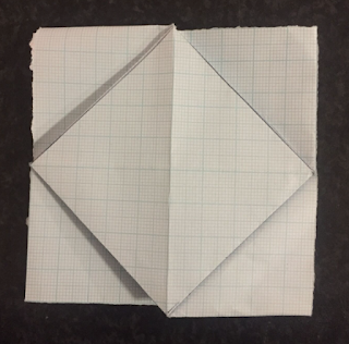
I discovered this leaflet by the designer Roger Chi-Huan Chuang. The design is fresh and bold. It is economic and versatile as it only uses one piece of paper. The folds within the leaflet create a grid which makes setting out the information within the leaflet flow better. I spent a long time learning how to fold the paper in this way and learning the way in which the leaflet would have to be laid out as the leaflet looks very different when folded in comparison to when it is unfolded.


I experimented with thin and thicker paper. The thiner paper was easier to fold however it began to hole quite quickly. The thinker paper was more difficult to fold but retained its structure better. For my final Piece I would like to use a textured, matte paper as this would give a more crafted feel to the leaflet which is well suited to this complicated and intricate method of folding. The leaflet is made from a square piece of paper. From experiments I have found that a 15cmx15cm square is a good size as it means I will be able to include all the necessary information needed and the folding is not too fiddly.