OUGD603
EOYS
Further Developments
Following our last meeting, we decided to go away and look at the 3D design created by Hannah. We need to now consider colour, typography, and composition.
 |
| Figure 1. |
I create some 3d shapes based on the original sketches but introducing more geometric shapes. I considered the layout more than the previous sketches. Most of the images above use a grid consisting of squares and circles. As a group, we decided that the above images resembled a club night too much and we revisited our previous idea of more organic 3d shapes.
The three-dimensional element was carried through the other team members development sketches.
However, we found it difficult to settle on a colour scheme so we continued to experiment until a suitable scheme presented itself.
Colour experiments:
after many experiments, we seemed to come to a dead end with this design. Instead of continuing with this specific design we began exploring other avenues.
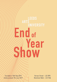
Josh created a curve pattern that showed the contours of the sculpture work created by the notable alumni.
Myself and Hannah took these lines and framed them within the grid I had previously used with the very bright colours (see figure 1.)
After creating a composition that we all likes we still struggled to nail down a colour scheme we could all agree on. Initially, we favoured the pink and blue scheme as the blue stood out against the duller pink. However, this made the branding feel overly feminine. We explored the use of black as a background colour and incorporating the blue and orange within the other elements. This allowed the very think lines to stand out more.


No comments:
Post a Comment