Thursday, 28 February 2019

OUGD603 - John Lewis - Research

OUGD603

John Lewis

Research


John Lewis and Partners' mission statement:
'John Lewis & Partners is more than a name. It means we're all owner's, committed to giving you, our customers, the highest quality products and service.
Because for us, it's personal.

John Lewis & Partners Brand Identity.
Pentagram
'The identities have been created to support the strategic ambitions of the two retail brands, and elevate the overall partnership's defining characteristic: its employee ownership model.'
'The new brand guidelines' logotype is inspired by a Peter HAtch pattern created for John Lewis Partnership on the 1960s.

The brand identities are informed by a shared design system; developed by Pentagram to bring coherence, clarity, and flexibility to the three organizations, and their full suite of products and services

Different versions of the logo can be used depending on the requirements of the application; responding to a wide range of products, communications, and customer experiences while maintaining recognition and building a cohesive customer experience. 

A typographically confident style is used in tandem with the patterns to create impactful campaigns

Distinctive colour palettes provide a striking singularity through the use of neutral colours, allowing product and content to take centre stage. 

The colour scheme is flexible and infinitely adaptable, particularly for Waitrose, which operated in the louder world of supermarket retail. 

The result is a flexible and distinctive visual language that communicates the full spectrum of activity associated with each of the Partnership's retail businesses: both separately, and in the moments where they come together. 


What gifts/experiences do John Lewis & Partnership provide?
In-store experience gift cards (the style experience / the beauty experience)
Luxury Gifts (most popular)
Gift collections
Games & Puzzles
Novelty
Silver Gifts
Stationary
Gift Experiences

History of Gift Giving


Humans are social creatures who enjoy others company and expressing our feelings through the giving of gifts. 
Researchers believe that cavemen gave presents like unusuallyly shaped rocks or animal teeth to strengthen social connection and show their appreciation to others. As social structures developed, the gifts became more elaborate and decorative.

Pre-Colonial times:
For thousands of years, Native American tribes have engaged in the tradition of potlatch. Predominantly a tradition of Pacific Northwest tribes, the potlatch was a complex ceremony where property and gifts were given to confirm or reconfirm the status and wealth of the gift giver. So, the more elaborate the presents and ceremony, the more powerful the gift giver. A powerful tribe leader would be expected to shower his tribe, according to their rank, with elaborate gifts. Similarly, IƱupiat tradition in Alaska dictated that upon returning from a successful hunt, whaling crews gave the largest portion of their catch to other tribe members. The more tribe members received, the more respected the whaling crew.

Early records of Egyptian history show that the deceased was buried with goods or gifts required for the afterlife. It was the oldest son’s duty to oversee his parents’ burial and ensure they had everything they needed. At the bare minimum, these gifts would include everyday objects like bowls, combs and food, while wealthier Egyptians would be buried with idols, amulets, jewellery, furniture and other valuables. Each gift had a different purpose, but most served to protect and help the deceased’s transition to the afterlife.

Gift giving also played an important role in Ancient Greek society. Elaborate, decorative gifts were given to express emotion, build relationships, and in the spirit of mutual aid or hospitality – a central concept of Ancient Greek culture. Families were expected to welcome travellers, who could be Gods in disguise, into their homes. A proper welcome included presenting travellers with a meal and a place to rest. Gifts were also given as a sign of respect and devotion. For example, it was customary to present Gods with gifts in exchange for safe passage or protection on the battlefield.

During the Middle Ages, gift exchanges played a significant role in social interactions. Gifting offered a meaningful way for people to foster social bonds, or show allegiances to powerful people and institutions, like the king or church. Dowries are a prominent example of medieval gift giving that was designed to promote relationships. Involving the bride’s father presenting lavish gifts to the groom in return for marrying and taking care of his daughter, these engagement gifts included land, money, livestock or precious metals.


Why do we give gifts?


Cultural requirements - Christmas

build and reinforce relationships - some sociologists think we only give gifts to people we want relationships with. 
Show love and devotion - theory of symbolic interactionism 
Symbolic communication - we attach symbolic meanings to gifts. 
To receive something in return - Since gifts represent our desire to build or cement a relationship, they also require some form of reciprocation. Contemporary sociologist Dimitri Mortelmans argues that gift-giving creates a 'debt balance' so to prevent ill feelings gifts must be repaid creating a cycle of gift giving. When reciprocating a gift, it should be of roughly equal value as giving too little signifies that you don’t value the relationship while giving too much means that you overvalue it and causes feelings of embarrassment
To help others - some gifts are given with no expected return. Love and appreciation are two of the biggest motivators for altruistic gift giving. One theory claims that dopamine-using pleasure circuitry in the brain is activated by charitable giving.
Find a mate - Research conducted by biologists suggests that as serial monogamists, humans use gift giving to attract and retain mates.


Harvard Business Review: 'Gifts don't express appreciation, people do.'

Wednesday, 27 February 2019

OUGD603 - John Lewis - Brief

OUGD603

John Lewis

Brief


key points:
Create an illustration or animation led a piece of communication that uses a variety of digital media. It should celebrate how: 
- a memorable gift is not only an object but experience and store of emotion
- at john lewis & Partners, you can give a unique gift that will never be forgotten
'A more personal service'
'Thoughtful giving'

Target Audience:
Young adults
mid 20's to mid 30's
Short on time
they want aspiration, inspiration and an experience

Outcome:
animation or illustration led
across a variety of digital touchpoints
e.g. digital screens in store, website, social media

In collaboration with Paul Edwards

Monday, 25 February 2019

OUGD603 - EOYS - Evaluation

OUGD603

EOYS

Evaluation

As a team, we worked well together. Everyone expressed their opinion without any resistance and everything said was taken into consideration. As a group there was no obvious leader, this was beneficial. We tended to discuss our ideas and then go away and develop them individually. We would then come back together and discuss what we had done and decide where to go from there. There was an open channel of communication right from the start and if anything needed discussing outside of university we could do this over Whatsapp. The only downside of this was that the development stage was quite long as we took a long time to decide on a solid concept initially. The concept we choose was quite loose and there was a lot to explore, this wasn't ideal for such a short time frame.  If we were to do this brief again we would plan our time better, spending less time deliberating colour scheme and more time creating extensive collateral including social media accounts, physical invites, and wayfinding.


Sunday, 24 February 2019

OUGD603 - EOYS - Final Outcome and Mocks

OUGD603

EOYS

Final Outcome and Mocks


We delegated mock ups between ourselves
Neve: Poster / Blenheim Walk Mock-up
Me: Publication Ad
Josh: Email header
Hannah: Flyer

We collated the mockups on an A2 poster. This was professionally printed on high gloss paper ready to be resented.
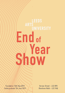
The final outcome is influenced by the work of alumni. The circle represents the community if graduates, showcasing the link between today's graduates and tomorrows notable alumni. The pattern used creates an eye-catching and engaging design that draws peoples attention to the information on the poster. The circle adds a bold element to the design, giving it more impact from a distance. The collateral shows the versatility of the design and how it is easily applied across many touch points. 
DIN Alternative Bodl was chosen as the typeface as the tall, structured nature of the typeface contrasts against the smooth fluid lines. 

OUGD603 - EOYS - Further Developments


OUGD603

EOYS

Further Developments

Following our last meeting, we decided to go away and look at the 3D design created by Hannah. We need to now consider colour, typography, and composition.

Figure 1.


I create some 3d shapes based on the original sketches but introducing more geometric shapes. I considered the layout more than the previous sketches. Most of the images above use a grid consisting of squares and circles. As a group, we decided that the above images resembled a club night too much and we revisited our previous idea of more organic 3d shapes.
The three-dimensional element was carried through the other team members development sketches.
However, we found it difficult to settle on a colour scheme so we continued to experiment until a suitable scheme presented itself.

Colour experiments:


after many experiments, we seemed to come to a dead end with this design. Instead of continuing with this specific design we began exploring other avenues.

Josh created a curve pattern that showed the contours of the sculpture work created by the notable alumni.


Myself and Hannah took these lines and framed them within the grid I had previously used with the very bright colours (see figure 1.)


After creating a composition that we all likes we still struggled to nail down a colour scheme we could all agree on. Initially, we favoured the pink and blue scheme as the blue stood out against the duller pink. However, this made the branding feel overly feminine. We explored the use of black as a background colour and incorporating the blue and orange within the other elements. This allowed the very think lines to stand out more.


Saturday, 16 February 2019

OUGD603 - Wonder Book Cover - Submission

OUGD603

Wonder Book Cover

Submission

Submission details:

The deadline for entries is 5 March 2019 at 2.00pm.
All entries must be submitted as a PDF via the entry form. Entries submitted in any other way, including by email or hard-copy, will not be accepted.
Please name your PDF with your full name and the award category for example: Joe_Bloggs_NonFiction
Entries must be supplied in the following format:
  • PDF
  • 300dpi
  • CMYK
  • 5mm bleed
  • Crop marks to be included
  • Ideally colour managed to ISO Coated 39 or ISO Uncoated 29 (optional)
  • Maximum file size 5 MB
Please include the front cover only on the first page of your PDF and a full cover spread (front, spine and back cover) on the second page of your PDF.
Make sure to use the design template and cover copy supplied for each category brief:


OUGD603 - Wonder Book Cover - Evaluation

OUGD603

Wonder Book Cover

Evaluation

Originally I intended this brief to be short. However It has ended up running over time by a considerable amount. Mainly because I spent a long time reading the book. I think this gave me a firm grounding when it came to idea generation as the ideas were backed by the storey line and things in the book.
I tried to produce as many initial sketches as possible and develop the strongest ideas. However I only ended up developing one idea and the final outcome is not miles away from the original sketch. There wasn't a great deal of iterations and I think if I were to revisit this brief I would spend longer on developing the composition and other aspects at an earlier stage.
I feel like the first version (digital collage) of the cover was more obvious. for example it was clear that the background is a fridge. However, it looked disjointed and lacked depth, especially with shadows etc.
The illustrated version may be more appealing to penguin as every past winning cover has some aspect which is illustrated in the children's category.

Thursday, 14 February 2019

OUGD603 - Wonder Book Cover - Final Outcome.

OUGD603

Wonder

Final Outcome.


OUGD603 - Wonder book cover - Developments

OUGD603 

Wonder


Developments

initial sketches


I tried to create the cover on photoshop using a collage method. From afar I am happy with the outcome but if you were to zoom in the quality is quite bad and looks amateur.

To improve this i will try to illustrate it. This way I can add shadows and hopefully it will look less disjointed. 

I researched illustrators to see what style I would like to try to replicate.

Owen Davey 


Suzanne Diaz


Tishk  Barzanji


I selected a colour palette inspired by Suzanne Diaz's work


illustrated version


I am much happier with this version. After making a few adjustments to the design, like making the fridge handle silver with a reflection to make it more recognisable as a fridge. I showed this in a crit and the feedback was really positive. It is different from all of the space helmet themed designs, and it seems like something penguin would go for as the hand drawn style is apparent in every past children's cover.


Monday, 11 February 2019

OUGD603 - Adidas - Brief

OUGD603

Adidas

Brief


Summary
In Collaboration with H+K Strategies

Aim: Brake down the barriers which cause young women to drop out of sport by creating a service, brand experience, campaign, digital experience or product (app or digital build for example). The outcome must: get girls engaged with a sport (specifically: tennis, swimming, rugby, weightlifting, hockey and boxing) 
Focuses on removing the mental or physical barriers that prevent girls from getting onto, or staying on, the fields, courts and pitches. 

Target audience: Young Female athletes - 14 to 19 year old females. Amateur to future professionals. Must live in one of the major cities.  

Locations: London, Paris, New York, Tokyo, Shanghai and LA.

Deadline: 20th March 2019, 5pm GMT

Further research: 
-Adidas Create Change Campaign
- H+K Strategies
- Billie Jean King

Statistics:
In London, Paris, New York and Tokyo alone, over 50% of girls don't play competitive sports and over 25% of girls stop playing sport between the ages of 14-17.

Barriers:
- Don't see a future
- legacy of inequality 
- lack of infrastructure
- lack of role models
lack of funding

What Sport will you choose? - Weightlifting
What barrier will you focus on? - lack of role models / lack of infrastructure