OUGD406
Studio Brief 3
Initial Crit
We presented our initial ideas.
Inspiration:
As a group we collated our different styles to find a design that would be most suitable.
The design had to be clean and stylised.
Feedback:
Using something simplistic with colour could be most effective
Keeping a running theme through the design - establish 3-4 colours to use, and a style of design and imagery
Logo could be a hand
Could create letters out of hands
Using half tones - Craig Redneck
logotype, way finding, hashtag with peoples hands in front of their work,
The name handmade and the simple hand, works with or without colour, the simplicity
if colour is used - need to be careful if using skin colour
Animate the hand as it gets closer to the time of the exhibition - holding the number of fingers up to represent the amount of days.
Fold out pamphlet that is guided by the hands
Next Steps:
We have designated roles to each member of the group.
We will now decide on colour scheme and typeface.
The design that will influence the overall branding is the following
Fold out pamphlet that is guided by the hands
Next Steps:
We have designated roles to each member of the group.
We will now decide on colour scheme and typeface.
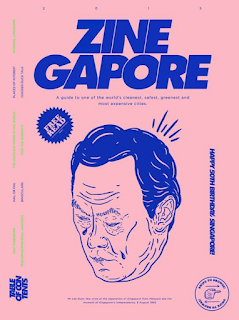
The design that will influence the overall branding is the following
this is very stylised and uses bold lines. It would work well in colour and a sans serif, rounded typeface would compliment it well.


No comments:
Post a Comment