OUGD406
Book Design Final Crit
Rational:
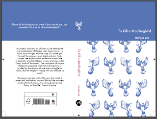
The design uses the Marber grid as it gives a classic feel. This sophisticated grid system reflects the complex issues in the book. Where as, the illustrated birds reflects the innocent and naive point of view of Scout, the narrator. The blue of the cover represents the children's hope, something that peaks and troughs throughout the book.
For this crit I presented two versions of the same design. One uses Baskerville, a serif typeface. The other design uses Futura, a sans serif to make it more contemporary.
Feedback:
- The white bird on the spine creates a 'point of difference'
- The book is similar to penguin classic, it was suggested it is a bit cliche?
- Not very imaginative, but aesthetically pleasing
- Appeals to an older audience
- good use of colour and layout
- the type on the spine should be the same colour as the rest of the book.
- simple but effective
- the text on the back cover should be aligned
- Serif font highlights the serious aspects in the story line - classic nature
- the serif type is more sophisticated so works better with the design.
- considering altering the grid to add an original element
- the concept behind the birds is good, however, is it too obvious? Many previous covers feature birds.
- Have the spine in blue and the text on the spine in white.
- The purple on the spine looks out of place.
- To keep the purple in the spine, make one of the birds purple. This will incorporate it in the design and suggest segregation based on colour without using obvious black and white.
- don't need box around blurb
From this feedback I will make changes to my design. I will add purple to the a bird on the front cover to justify the use of the purple on the spine. This will also suggest segregation, a key theme of the book. I will align the text on the Blurb and remove the box around the text.
Finally I decided that the colour scheme needed to be more subtle since the design is so delicate. I used a darker blue for one bird and the type on the spine. This acts as a comment on society and how the colour of our skin changes how we perceived.


No comments:
Post a Comment