OUGD503
SB01
Penguin Mock Ups
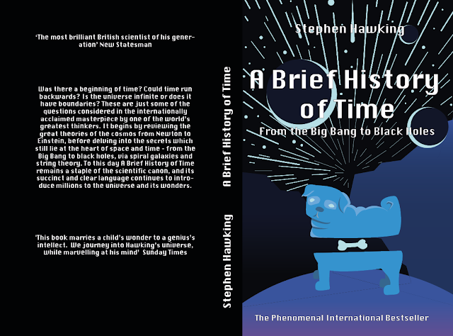
I have mocked up my top 4 designs.
This cover design is based around Hawking's argument that two space dimensions would no be enough to support complicated creatures like animals. He explains how a two dimensional creature would not be able to eat as they would not be able to digest it completely, because if there was a passage right through its body, it would divide the creature into two separate halves.
2.
Space painting by Lewis Andrews
3.
Title made to look like a division equation with logarithms as the 'e' in time and a differential instead of an 'f' in of. After speaking to a friend who studies Medical Engineering it would work better if it said Y(t) = rather than x(y)=. The Hand written text makes it look more authentic and all previous winner of the non-fiction design have used some sort of hand drawn element. The complimenting typeface is Kohinoor Bangla.
4.
This cover is inspired by Chapter 4: Elementary Particle and Forces of Nature. In this chapter Hawking explains the that atoms are not fundamental particles, but are in fact made up of smaller constituents. He tells us that atoms can be broken down into protons and neutrons and smaller counterparts such as electrons and Quarks. There are 7 kinds of quarks: up, down, strange, charmed, bottom and top. A proton is made up of two up quarks and one down quark. A neutron is made up of two down and one up quarks. The illustration on the cover shows a oxygen atom which contains 8 neutron, 8 protons and 8 electron (shown on the outer ring). Inside each neutron/proton is there respective quarks.
Feedback
Design 1.
Really different to all the previous covers. Really pushes the expectations of a non fiction book but on the other hand it could be interpreted as a non fiction book. Would appeal to younger readers. Its experimental and new.
Design 2.
Very obvious response. Its good that it is a collaboration but I have already seen a very similar response from other students in the studio.
Design 3.
Math formula clearly reads as the title. Easy to understand and see the reference. Simplistic. Might not stand out on the shelf. Very different from the previous covers, which is good. Might work better if it was written on an actual chalk board with smudges etc.
Design 4.
Subatomic break down of a particle. Concept might be too complicated for those who have no prior knowledge, although once they have read the book they will be able to understand the cover.
Evaluation of feedback
The feedback was helpful. Although I like all 4 designs I think design 1 pushes the boundaries the most, this is something the judges are looking for. This cover tells a story and shows an interpretation of one of the more memorable explanations in the book.


No comments:
Post a Comment