Initial Ideas
The rational
I will develop is the ‘Loud’ typeface
Rationale:
The typeface called Loud will use a bold sans serif type.
Large counters will be used to represent an open mouth. Suited to title fonts,
this type will be used as the headline for a music magazine or the branding for
a music venue or pop band. This typeface will be attention grabbing and in your
face. The typeface will explore using neo-humanist sans that have a reduced
stroke contrast and apertures are even more open. The x heights are larger.
The typeface will be based on Helvetica.it will challenge the perception of Helvetica being a corporate font.
I experimented with the idea of using large circle counters
to represent an open mouth. This was inspired by the work of Studio Laucke
Siebein (OFFSET Sheffield) who designed the visual identity of
RijksakademieOPEN (open days) in which the circular ‘O’ screams. I experiment
incorporating this circular ‘O’ into Helvetica as the negative space of the
counter leaves space for interpretation and functions as an icon as well as
typographic element. I created a grid centered around the ‘O’ so every letter
was consistent and occupied equal space.
I continued to develop this idea by removing the counters in
the letters to make a bolder and blockier type.
This type resembled the work of Morag Myerscough of
supergroup London. Her work is very bright, strong and bold.
I realized that
most of her typography is 3D or incorporates a 3D shadow. I wanted to replicate
this. To get a better understanding of how to draw a letter in 3D and what
elements would be visible from different angles I created the word ‘loud’ in 3D
using paper. I took photos of this from different angles and drew each individual
letter.
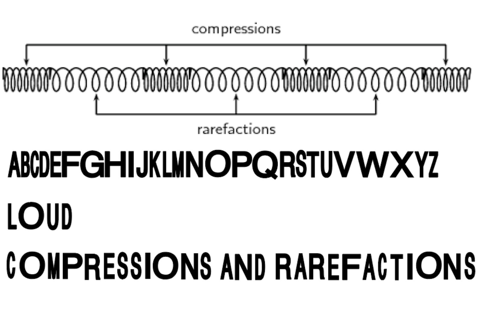
I also considered the word loud in terms of music and sound.
I considered it practically in terms of sound waves and their scientific
properties. Sound waves are longitudinal waves that consist of compressions and
rarefactions. The compressions are regions of high air pressure while the
rarefactions are regions of low air pressure. I represented this using
typography by creating an alphabet that compressed and rarefacted.
Finally, I explored another idea associated with music. This
type font was inspired by the digital representation of sound waves.


