OUGD503
SB02
StarPack Development
Lucy's developments
Progression of pattern design
Lemons
Packaging and logo development
Initial logo designs. I was important that they worked well in black and white before experimenting with colour.
The swatches were taken from Lucy's paintings. They were than added to the logos to see if it would create dimension.
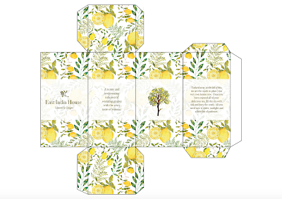
This will be the final packaging design. It includes a short description of the tea and information about the second function of the tin. The Text reads: ' Tucked away in the lid of this tin are the seeds to plant your very own peach tree. Once you have enjoyed all of your delicious tea, fill this tin with soil and bury the seeds. All you need now is water, sunlight and a little bit of patience.' (type of tree is dependent on the type of tea.)
The typeface is Bodoni 72.
I will now apply it to the seed packets and create mock ups of the tins.
Seed Packaging
The seed packaging follows the same design as the tins but has instructions on how to plant the seeds on the back.
Adding tree illustration
The images bellow show the front and back of the seed packet with the tree.
I think the addition of the tree makes the design too busy, especially as the seed packages will be quite small.
I will change the shape of the tin to a square. This way I can include the Tree on one of the sides. If the tin remained a hexagon four out of the six sides would have content on them. This would make it unbalanced.
Final Nets


No comments:
Post a Comment