Sunday, 11 February 2018

OUGD503 - SB01 - Dropbox - Development


OUGD503


SB01


Dropbox - Development


Some initial ideas for layout of the publication. The story boards show the narrative of a trip to the beach. It begins on a beach showing children playing, the colours would be light. The shot moves around to show surfers walking into the sea, then goes on to show a surfer duck diving under the water to reveal the plastic and rubbish pollution. As the illustrations show more rubbish the colours get darker. The change of colour scheme shows the change in atmosphere and the impact plastic and waste pollution is having on our coastlines. It hopes to communicate this idea without text to make it accessible for young children.

  Colour Scheme


Story Board sketches


Visual Research 

For this I looked at 1950's and 60's railway posters.


Limiting colour palette to 7 colours per image


Colour Palette


More developed sketches, experimenting with colour pallets. I think the colours move with the story, the lighter warmer colours reflect what people love about the ocean. The darker colours highlight the negative impact plastic pollution is having.


Considering Materials 


Colours
Different shades of blue. If the content is showing the damage the plastic waste causes the colours will be darker. If the content shows the enjoyment that can be had at the beach the blues will be lighter.

Layout
Story told over pages (traditional layout)
concertina booklet that unfolds to show the story played out in full.

Materials

Traditional ink
Traditional commercial ink uses petroleum as the medium for suspended pigmentation. Petroleum-based inks start doing damage long before they’re thrown away—from the minute they’re laid down on paper, they release volatile organic compounds (VOC’s) into the air. These chemicals contribute to global warming and the indoor air pollution in your house and office. They also harm the environment when they decompose, releasing toxic chemicals into waterways and the atmosphere.


Water based inks
Traditional water based inks are better for the environment than solvent based inks because they contain far less VOC's, VOC's are Volatile Organic Compounds that are released into the atmosphere as the ink dries. Because water is the main "solvent" in standard water based inks the VOC level is dramatically reduced making them much better for the environment. They are however all based on materials that are ultimately derived from petroleum or have been dug out of the ground (extenders/fillers), this means they are "exhaustive materials" that will eventually run out. 

Soy based ink -
 The most common use of soy oil in ink occurs in offset lithographic ink – the kind most commonly used in commercial printing. Black offset litho ink must have at least 40 percent soy oil content to qualify as a soy ink.

 “We have reduced our VOC’s 22 percent and HAP’s (hazardous air pollutants) by 93 percent by switching from petroleum-based ink to soy and vegetable ink.”

Issues with soy inks:
Soy is one of the major crops used in conventional agriculture’s monoculture system, which severely limits biodiversity and inhibits ecosystem resiliency. Over 90 percent of U.S. soy fields are planted in genetically modified soy; GMO’s present a range of environmental concerns. And, the increase in global demand for soy products contributes to large scale deforestation in the Amazon rainforest and elsewhere. 
On the other hand, soy beans require minimal chemical input compared to many other crops. There’s no denying that even vegetable inks containing mineral components are usually far less toxic than conventional inks. And, veggie inks are proving to be more biodegradable as well.

Earth Inks -
Earth inks is a business that create high quality inks in a comprehensive range of colours. Earthinks are glycol and silicone free, contain no heavy metals and are near zero VOC levels. Every product in the range is based on natural ingredients such as soy, starch, sugars, dextrin, tree resin, cellulose and other polysaccharides. Natural waxes are used to replace standard synthetic grades, and natural oils are used to defoam in place of mineral oils and silicones, ensuring Earthinks are completely in line with food packaging regulations.
They are water based, natural printing inks.
The company also runs Planet Earth, an ink management software that and free ink recycling. 
Earthinks are water based inks made from raw materials that can be replanted or regrown and so are a much more sustainable product for now and the future and also have the advantage of not being subject to wild fluctuations in oil price.


Issues with pigment - 
Pigments are generally mineral in origin and it’s not uncommon for them to be toxic. For instance, carbon black is widely used as the pigment for black ink and is classified as a Group 2B carcinogen. (The agent (mixture) is "possibly carcinogenic to humans". This category is used for agents, mixtures and exposure circumstances for which there is limited evidence of carcinogenicity in humans and less than sufficient evidence of carcinogenicity in experimental animals.) 


Water soluble Paper-
water soluble paper is a unique material which dissolves completely and rapidly in water along with anything printed or written on it. The water-soluble paper and tape is cellulose based (finely ground tree pulp). The paper is non-toxic, biodegradable and 100% recyclable. Products made of this material will dissolve in any temperature of water, leaving no residue behind. Agitation (stirring, providing a forced flow of water) helps to break down the dissolvable fibers. It is 100% dispersible in water in 30 seconds or less. It is recommended that water or soy based inks to keep with the solubility of the product, however some applications do not require this.


 Considering Typefaces
The booklet will show the Surfers Against Sewage logo. The text will be kept to a minimum but will contain a few tips on how to reduce each person individual plastic usage. I will use a typeface as close to the one used by SAS as possible to keep the design of the booklet as simple as possible as contrasting types may overcomplicate it.


What the Font App
The closest typefaces were:
 Parisine Plus Std Sombre Regular
Asterisk Sans Pro Black Italic
Novel Display Black Condensed

Closest free typefaces:
Parisine
Source Sans Bold Italic
Source Sans Black
Open Sans Condensed Bold


Source Sans Black is the closest typeface.


The booklet will contain short instructions about how to reduce plastic pollution
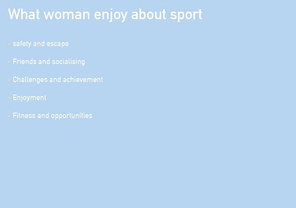
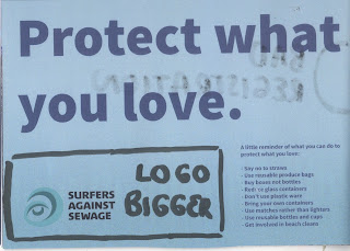
What can WE do?
- Say no to straws
- Use reusable produce bags
- Buy boxes not bottles
- Reduce glass containers 
- Don't use plastic ware 
- Bring your own containers 
- Use matches rather than lighters
- Use reusable bottles and cups
- Get involved in beach cleans

These small changes can make a huge difference 

Possible layouts


Adding Texture and Text


Test Print


The test print was unsuccessful, the colours didn't print well. The black writing should be a purple. There are some issues with overlap in the illustrations and the pages didn't print in order or the right way round. The biggest issue is that I set the scale to A5 landscape. I thought this would fit on a A3 but I did not consider crop or bleed. This means I will have to print it on A2 paper or re-scale the booklet to a size smaller than A5. Alternatively the Japanese method of binding can be used so the booklet can be printed on a4 rather than a3. I will have to consider the effect the binding will have in terms of creep. 

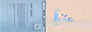
Title considerations. The title calls the book a love letter, however, it is a booklet. How would I show the booklet as a love letter? 

Allow people to actually send a letter to the sea. A rip out page, which encourages people to write a pledge to the sea about how they will reduce their single use plastic usage. The rip out page can be water soluble so it instantly dissolves when in contact with water. This way the letter is literally going to the the ocean. 'A love letter to the ocean.' This also means that people can keep the illustrations to remind them to cut down on their plastic usage.

Changes
- Change the size of Indesign document to something smaller but proportional. Consider bleed.
- make alterations to type and illustration faults.
- Change the information page to a letter, with an explanation that this page can be ripped out and delivered to the ocean.

Test Print 2


In response to the last test print I have made some alterations. I re sized the document to a size that would fit a whole spread on a A3 sized paper, including bleeds and crop marks. I corrected the orientation by making sure a selected the bind short edge option in the printers menu. There are still a few alterations to be made to placement and sizing of some objects and the registration of pages. 
The only major alteration was changing the list of things that can be done into a love letter. This made the title more relevant to the product. It is accompanied by a stamp and instructions to rip out the letter and 'deliver' it to the ocean. This means that only one page will be printed on the soluble paper. This will reduce costs and also mean that the rest of the book can be kept as a memento and a reminder. The list of things that can be done to reduce the plastic pollution is repeated on the last page so when the letter has been removed, the list remains. I changed the position of the of the information/letter page to the front of the book as it was important that the narrative stayed in tact without the letter. Remove the cover and first page and the story of the book remains.

Monday, 5 February 2018

OUGD503 - SB01 - DropBox Crit Feedback


OUGD503

SB01

DropBox Crit Feedback


Work Shown 
After producing three prototypes, I found that idea 1 could be developed the furthest and has the strongest associated digital touch points. I presented this idea at the crit.


I explained that the outcome had to be a graphic design response. It has to have both a physical and digital touchpoint. The physical outcome would be a publication. It will be made out of fully biodegradable material. It would be light hearted but impactful without being intimidating and depressing. 

The feedback I recievd was very possitive. The next step I should take is to create the publication, test and  review it. I also need to think about how I will create a digital touchpoint and how the use of social media can promote and empower the publication. 


OUGD503 - SB01 - Time Management


OUGD503

SB01

Time Management


To manage my time I have wrote down everything I have to do for every module. Considering deadlines I then filtered each task into weeks. I have planned for the next 5 weeks. 


Week 1

Week 2

Week 3

Week 4

Week 5


Saturday, 3 February 2018

OUGD505 - SB01 - Piano Research


OUGD505


SB01


Research


The Development of the Piano (Yale University Lecture)

Mozart was the first composer to switch from the harpsichord over to the piano.


Harpsichord
The harpsichord was the primary instrument of the Baroque period, 1600 to 1750. Baroque music is often described as tingling or jangling. 

Mozart (between 1770 - 1780) preferred the piano because the harpsichord lacked dynamics. It only had one dynamic level. (dynamic levels refers to relative loudness) At this time people started to switch across to an instrument that was known at that time as the Pianoforte. In musical dynamic terms terms piano means soft and forte means loud. This instrument allowed for gradations of sound. 

The Pianoforte was invented in Florence around 1700 by a man called  Bartolomeo Cristofori. It took around 50 years for this instrument to catch on and replace the Harpsichord. 

Mozart came from Salzburg, Austria. He was an employee of the Archbishop of Salzburg. He was a composer who worked at the piano, and so was his friend and contemporary Joseph Haydn. It was said that Mozart would do most of his composing in bed, he didnt need a piano as he heard the music in his head.


In 1781 he establishes himself as a freelance musician in the city of Vienna. He made a living by giving piano lessons to the aristocracy and play the piano to the public. By doing this he contributed greatly to both Piano Sonata and the Piano Concerto (he wrote 23 original Piano Concertos.) 


Mozarts piano only had one string per key (usually there would be 3) and was tuned down by half a step. At this time tuning changed a lot until the 20th century when it was fixed that A should be 440 vibration per second. His piano sounded shallow, there was not a great resonance and the sound dissipates very quickly.


Mozart dies in 1791.


Beethoven had been originally sent to Vienna to study with Mozart, but there were family problems. Beethoven was also a pianist, but unfortunately his teacher was his father. He told people that Beethoven was actually two years younger than he actually was, because he wanted him to be the next 'wunderkind',  the next child prodigy in order to make money. Eventually Beethoven moved to Vienna around 1797. In Vienna he impressed the aristocracy with the power of his play, the aggressive nature of it and the physicality of it. It was much more technical than Mozart had ever created.


Beethoven piano had two strings per key. His work often sounded out if tune because of this as it is very difficult to have two strings exactly in tune. Beethoven wrote 32 Piano Sonatas and five Piano concertos, the most famous of these is the Emperor Concerto. When performing, Beethoven struggled and his contemporaries described him as messy. This was because he was going deaf. 


Later Instruments:


The Graf Piano 


Conrad Graf
This piano is bigger than its predecessors. As it gets bigger, a bigger soundboard is needed. This is the main resonator. More tension is needed in the strings so they are not broken or come loose. An iron support is needed. Eventually the sound board rested in cast iron. A pin block is needed, this is where the pins that anchor the strings are. All of these things allow for a bigger, more powerful instrument. 

Franz Schubert played a Graf Piano


Franz Liszt played an Erard piano


Musical Impressionism


A period in the history of music running from1880 to 1920 (Mostly a French phenomenon) 
Clair de Lune
Style: Unexpected chords, new chords, often uses augmented triads. Chromatic approach to melody, doesn't have much structure.
'Mood paintings' Debussy's description of The Afternoon of a Faun (Inspired by Mallarme's poem)
Mallarmw's response to Debussy's piece: 'The music prolongs the emotion of my poem and paints its scenery more passionately than colour could.' Music as painting 

The Frog Pond by Monet, the brush work is made up of individual gestures. Same in music, a chord could be played very rapidly, you wouldn't hear the individual notes but get a wash of sound. 

La Cathedrale Engloutie (The sunken Cathedral), Monet pained the Cathedral over and over again. Debussy constructed a musical equivelent.


Traditional western musicians always tie line to colour. 


Triads


A chord is any combination of three or more pitch classes that sound simultaneously. A three note chord whose pitch classes can be arranged as thirds id called a triad. To determine whether a three not chord is a triad, arrange the three notes on the 'circle of thirds'. The pitch classes of a triad will always sit next to each other. There are 4 triads: Major, Minor, Diminished and Augmented.


Modernism


New approach to rhythm, highly irregular rhythms. New approach to orchestration. The moment the constitutes the begining of modernism: Stravinsky's Ballet Score for The Rite of Spring. 


The Structure of the Piano

Structure
Sound Producing Mechanism


Schematic Rendering of a Grand Piano


When a key is pressed, a hammer inside the piano strikes the strings from below. However, this only produces a soft sound.
One end of the strings is supported on bridges, which are attached to the soundboard. The vibrations of the strings are transmitted to the soundboard through the bridges, and a loud sound resonates as a result of the soundboard vibrating the air. The entire piano, notably the soundboard, vibrates to produce sound.


The mechanism of the piano that causes hammers to strike the strings when a key is pressed is called the "action." his mechanism allows the pianist to quickly repeat a note without having to fully release the key. Up until the introduction of this mechanism, when a key was depressed, the hammer usually rose and struck the string and was not ready for the next keystroke, until it had fallen back to its at-rest position.


The damper mechanism is another important part of the action. This mechanism quiets the sound instantly as soon as the finger is lifted from the key.


A piano keyboard has 88 keys. The number of strings depends on the model, but is usually around 230. For the tenor and treble notes, three strings are strung for each key, and for bass notes, the number of strings per note decreases from three, to two, and then to one as you approach the lowest bass notes.
In addition, the strings become shorter in length going from low-pitched notes to high. The thickness of the string changes in steps, and the higher the pitch of the note, the thinner the string. Strings for bass notes are wound with copper wire, while strings for tenor and treble notes use bare wire and are not wound.

Colour and Music

here are many theories about the relationship and translation from colour to sound. The most widely accepted theory seems to be from Newton's Colour Circle from his book from Opticks of 1704, showing the colours correlated with musical notes. 
Around 1665, when Isaac Newton first passed white light through a prism and watched it fan out into a rainbow, he identified seven constituent colours—red, orange, yellow, green, blue, indigo, and violet—not necessarily because that’s how many hues he saw, but because he thought that the colours of the rainbow were analogous to the notes of the musical scale. Naming seven colours to correspond to seven notes. 


Newtons colour circle
Musical Notes - Colour Correspondence 


Synesthesia

The word synesthesia comes from the Greek words syn meaning together, and aesthesis meaning perception. Synesthesia literally means cross-sensing, one of the senses being triggered by another sense. A synesthete might hear colours, taste sounds, see smells or any combination of the senses. Females and left-handed people are typically synthetic. Ratios of women to men synesthetes have been reported at 3/1 and even as high as 8/1. A typical feature of synesthesia is that the particular sensations, the colour blue associated the pitch C, are consistently experienced. 
Synesthesia has been known to medicine for 300 years. Traditional ideas about the experience have consisted of a ‘crossed-wire’ explanation. Somehow the sensory information is switching to a new channel and showing up in a different sense. Many studies are underway today and much information has been gathered about synesthesia. Richard Cytowic diagnoses five characteristics of synesthesia on his article Synesthesia: Phenomenology and Neuropsychology. The five characteristics are 1) involuntary experience 2) projection of sensations 3) sensations are durable and generic 4) sensations are memorable 5) sensations are emotional and poetic.
Hearing colours is quite a common experience among synesthetes. The perceptions of colours associated with particular sounds has been found to be consistent among individuals but not between individuals but no common set of colour and sound associations exist between individual synesthetes. Synesthesia is a personal experience and the details of the perceptions are completely subjective. 


Crit Feedback
Idea to create an instillation based on the relationship between colour and music by giving each not a specific colour.

Response
Relises on things that already exist
Develop own system
Consider the qualities of music, memories and emotive
Look at the work of Kandinsky 


Kandinsky 
The idea of music appears everywhere in Kandinsky's paintings. He believed shades resonated with each other to produce visual 'chords' and had an influence on the soul. Music - and the idea of music - appears everywhere in Kandinsky's work. Take his generic titles: Compositions, Improvisations, and Impressions. His mighty 10 compositions were created over more than three decades from Composition l in 1907 to Composition X in 1939. 
To support his colour theories, Kandinsky appealed in his manifesto to the evidence of synaesthesia, the scientific name for the condition in which the senses are confused with one another 


"Our hearing of colours is so precise ... Colour is a means of exerting a direct influence upon the soul. Colour is the keyboard. The eye is the hammer. The soul is the piano with its many strings. The artist is the hand that purposely sets the soul vibrating by means of this or that key. Thus it is clear that the harmony of colours can only be based upon the principle of purposefully touching the human soul."

Both Kandinsky and Schoenberg were seeking to create music dramas in which colour would be perceived on the same level as sound and action. And this before the invention of modern lighting.

Scriabin's Primetheus: Poem of Fire
https://www.youtube.com/watch?v=V3B7uQ5K0IU

Description of music in the Great Gatsby

“The moon had risen a little higher, and floating in the Sound was a triangle of silver scales, trembling a little to the stiff, tinny drip of the banjoes on the lawn.”

“The lights grow brighter as the earth lurches away from the sun, and now the orchestra is playing yellow cocktail music…”


Friday, 2 February 2018

OUGD503 - SB01 - DropBox Prototypes


OUGD503

SB01


DropBox Prototypes


Idea 1
Booklet or publication that illustrates the impact that plastic pollution is having on both the coastline and the ocean.
Printed on paper that biodegrades or disintegrates on contact with water. Must not release any harmful toxins. 


The booklet has a strong narative. MInimal text. The illustrations show people ejoying the coastline, as the story develops the affects of plastic pollution is shown. As the pollution increases the colours get darker, this change in atmosphere hopes to show the negative impact of waste in the ocean in an a way that is easy to understand for all ages.

Idea 2
Poster series That will grab the attention of beach goers as well as the coastline community 
use humour while getting the message across

Typography heavy, similar to the work of Craig Oldham


All posters use a strong typeface. Titillum Web, League Gothic or Chivo. Colour would be incorporated taking swatches from photographs of beaches

Idea 3
Boycot Single use Friends
A small booklet about reducing the use of single use plastic based around the quote from the fight club. Lo-fi document following a minimal design to reflect the its content. It aims to reduce wastefulness, there fore it will be printed on recycled paper with minimal ink usage.


Thursday, 1 February 2018

OUGD505 - SB02 - Presentation feedback


OUGD505

SB02


Presentation feedback


Feedback
What girls want from sport: More inclined if friends are doing it, group mentality, exercise looked at more of a social activity rather than sport.

What to do next: 
look at media exposure of women in sport
Consider deeper issues, for example, the clarks children's shoe names.
Consider how This Girl Can works for a younger audience.
Look at lack of female role models in sport. In a way that it is about the woman, rather than the results.