Friday, 13 January 2017

OUGD405 - Signage Systems and Information Graphics

OUGD405

Notes on:
Signage Systems and Information Graphics by Andreas Uebele

Eye level is 163cm above ground, however signs should not be placed at eye level as it is easily swamped, a good height is around 145cm.

Information at a trade fair or airport must be high up where it can be read above people’s head.

A condensed font with large apertures lends itself well to wayfinding systems as it takes up less space. It should ideally have a high x-height, as this reinforces legibility.
Plain and functional type works best such as Univers, Helvetica, and News Gothic Bold. The type must work in a large format and blend in with the architectural features of their surroundings. Sans serif fonts are more appropriate than serif fonts. Although serif founds are considered easier to read due to the individual features of each letter, it is not a relevant argument when designing wayfinding systems. This is because there tends to be little writing, therefore functionality is more important.

Pictograms:
For the Munich Olympic Games in 1972, Otl Aicher and Gerhard Joksch designed a system of pictograms that is still in use today. Olt Aicher’s pictograms use a grid and take on a high degree of abstraction.

Arrows:

There are two types of arrow design, one where the terminals of the arrow head run parallel to the shaft and the other where the terminals cut off at right angles. The terminals of the first design seem aggressive whereas the second design is more geometrically distinct.

OUGD405 - Way finding Interim Crit


OUGD405


Interim Crit

For this crit I presented what I am currently working on. 
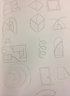
I explained my idea of an underground way finding system that satisfied the curiosity of what layed under the streets of Leeds. I showed the placements of the areas where the underground spaces are and told the group that I wanted the system to have an uneasy and gritty feel about it to represent the feeling a war bunker would have and show the connotations of being underground such as the dark and being buried. 
My idea is to have all of the symbols and pictograms on the floor. The pictograms will be stencils and spray painted onto the ground. I will also create a map for the system that has the same aesthetic. I also would like this to be accompanied by the blue prints of the spaces, either in a book form or sprayed real size onto the ground to give the audience a sense of scale.

This is some of the work I showed in the crit. Most she my pictogram development work.


The feedback I received suggested I should look at using more threatening shapes in my designs such as triangles or symmetrical shapes. I should also investigate man hole covers and the details on them. It was suggested that it would be interesting to see the pictograms lit up on the ground, I thought back lighting or glow in the dark vinyl. The pictograms should come with a map to show the trail, I would be interesting to do the map in the style of the London Underground as it links well. Creating arrows for the system would also help the audience and allow the system to become more accessible.
I will now apply the feedback I have received to my work. 

Response:
In response to this crit I have made changes and added aspects to my wayfinding system. 

I changed my pictograms to be in triangles to be more threatening to match the aesthetic of the system. Triangles are also more attention grabbing, this is important as the sign system will be on the ground and therefore more difficult to spot.


I created a map to compliment the pictograms. I have created it in the style of Harry Beck's London Underground map. I have only used vertical and horizontal lines to create the map to add a twist. I have numbered each stop on the map, each number will coincide with a page in a booklet which I will produce to provide extra information to the user. 


I created arrows to go with the way finding system to direct users, these will also be sprayed onto the ground.


Tuesday, 10 January 2017

OUGD404 - A1 to A4 Folding


OUGD404

A1 to A4 Folding 

This is a technique is often used for folding large architectural or engineering drawings. 


For easier instructions to follow use: https://vanoengineering.wordpress.com/2012/07/29/folding-paper-for-engineering-architecture-and-construction-drawings/  

Friday, 6 January 2017

OUGD405 - Thoughts on Objectivity and Subjectivity in Graphic Design


Thoughts on objectivity and subjectivity in graphic design

A brief analysis of The Debate: Wim Crouwel and Jan van Toorn


Objectivity is a judgment based in observable phenomena and uninfluenced by emotions or personal prejudices

Subjectivity is a judgement based on individual personal impressions and feelings rather than external facts.


Crouwel represents the ideal of the designer as the selfless messenger; Van Toorn espouses the notion of the graphic designer as an interventionist – an enabler of criticism and empowerment.

Crouwel has the viewpoint of: ‘I believe that as a designer I must never stand between the message and its recipient.’; thereby taking the objective stance. Van Toorn rebuts this idea with a subjective viewpoint: ‘I do not believe that a designer can adopt the position of neutral intermediary. The acts you perform take place through you, and you are a subjective link. But you deny this subjectivity, meaning you view your occupation as a purely neutral one.’ It is possible to argue that Crouwel believes Van Toorn would be more ‘cautious’ in accepting a job if it did not conform with his personal views and beliefs.

As the discussion continues Van Toorn vehemently states: ‘You impose your design on others and level everything. You were at the forefront, and now our country is inundated by waves of trademarks and house styles and everything looks the same.’ He continues: ‘To me, your approach is not relevant, and in my view you should not propagate it as the only possible solution for a number of communication problems, because it’s not true. What your approach does is basically confirm existing patterns. This is not serving communication – it is conditioning human behavior.’

Van Troon argues that there can be no such thing as an objective message and that the designer can take no neutral stance, because any act of design, in which the designer takes the role of intermediary, will introduce an element of subjectivity. Since this is the case the designer should explicitly acknowledge and make use of the opportunity to construct and critique designs social meaning whilst making sure to not be offensive or disrespect others views. For the designer to take this course, rather than hiding behind a mask of neutrality, both engages and liberates the viewer.

In conclusion, objective work conveys only the essential information needed in design, But the danger of only creating objective work is that it can lead to the same design response in all situations, producing work of great uniformity, in which any sense of identity is lost. This raises the question ‘Does objectivity within graphic design lack human contact?’. On the other hand, does subjectivity within graphic design mean designers should only do work that they can fully agree with? For example, within political branding, must the designer promote their own political convictions? This would narrow the designers work prospects as well as raising them to something more than merely the designer but someone who must be fully invested and part of whatever they have created content for. This confliction suggests to me that graphic design must be both objective and subjective to be functional and successful. A designer’s work must convey information well but it also must also have some subjective qualities to demand attention from its desired audience.