SB01
Developments
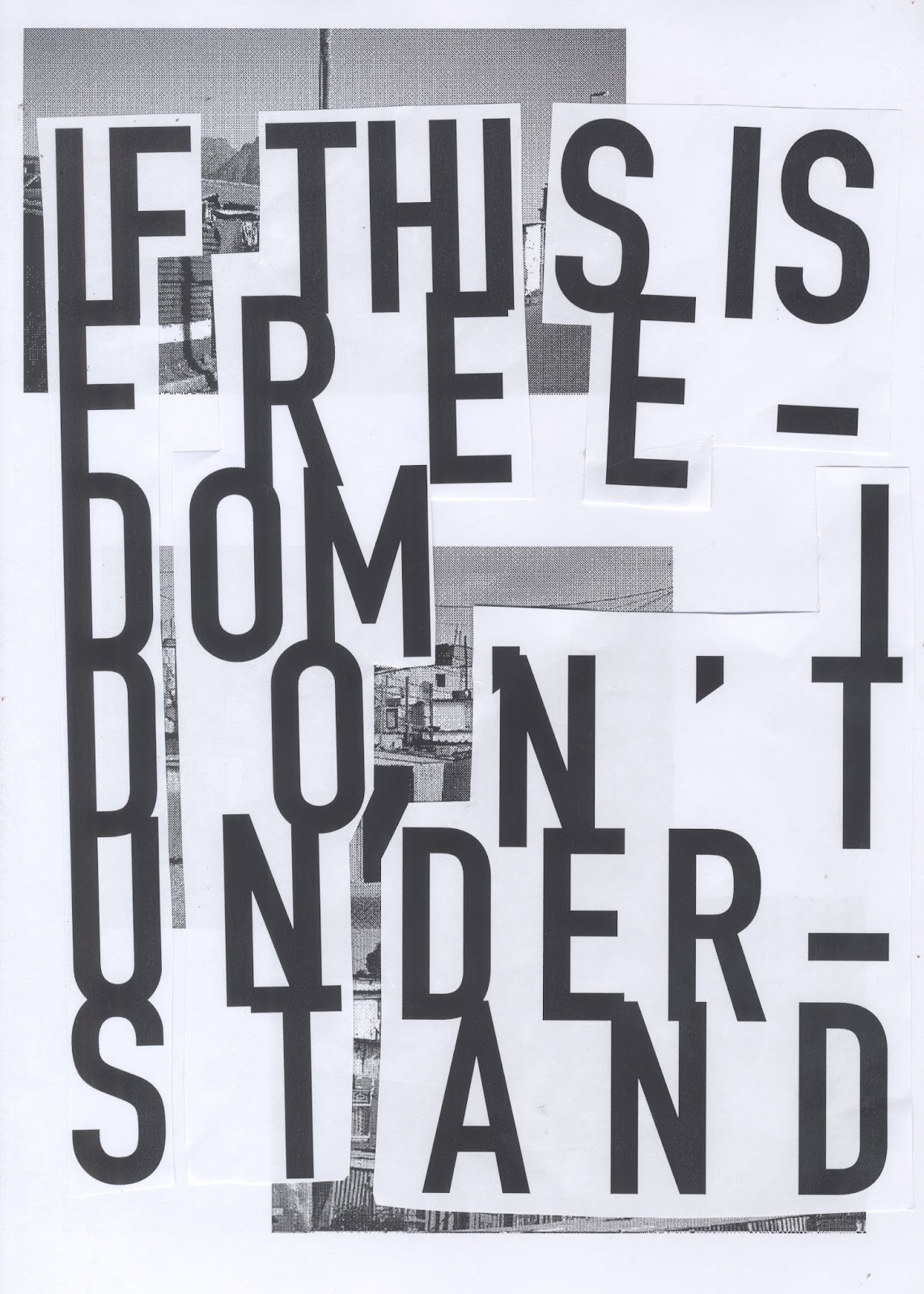
'If this is freedom' Posters
A two part poster based on lyrics by the Jam from the song 'A' Bomb in Wardour Street (Album: All Mod Cons).
The Lyrics:
And they tell you that you're still a free man
If this is freedom I don't understand.
Political message:
Apartheid in South Africa.
Apartheid ended in 1991. As part of apartheid the government at the time segregated the population into different living quarters within cities under the 'Grouped Areas Act' (1950). This was based in race hierarchy with white people being at the top of the hierarchy, followed by Indians, coloured and lastly black people. In areas assigned to black people the government provided some 'matchbox' houses but massive overpopulation of these areas lead to tin houses being common place. This is still true today in townships such as Soweto. Living conditions are still poor and poverty and crime is still very high. After almost 30 years of aparthied being abolished living conditions haven't improved for those who were forced to live in segregated communities.
The aim of these posters is to highlight the poverty that still exsist now and create any sort of reaction that might ignite change.


 |
| Photo Cred: Moses Gathua |


Typeography


The most appropriate way to create this poster is screen printing as it is hand made and in line with the punk DIY culture.
Halftoned images of shanty tones:


Developments


Physical Manipulation
Collage


 ]
]
The aesthetic mimics the classic punk style. Although I thin the pastiche comes across quite lighthearted. I don't think this is appropriate for such a strong message.
Scans


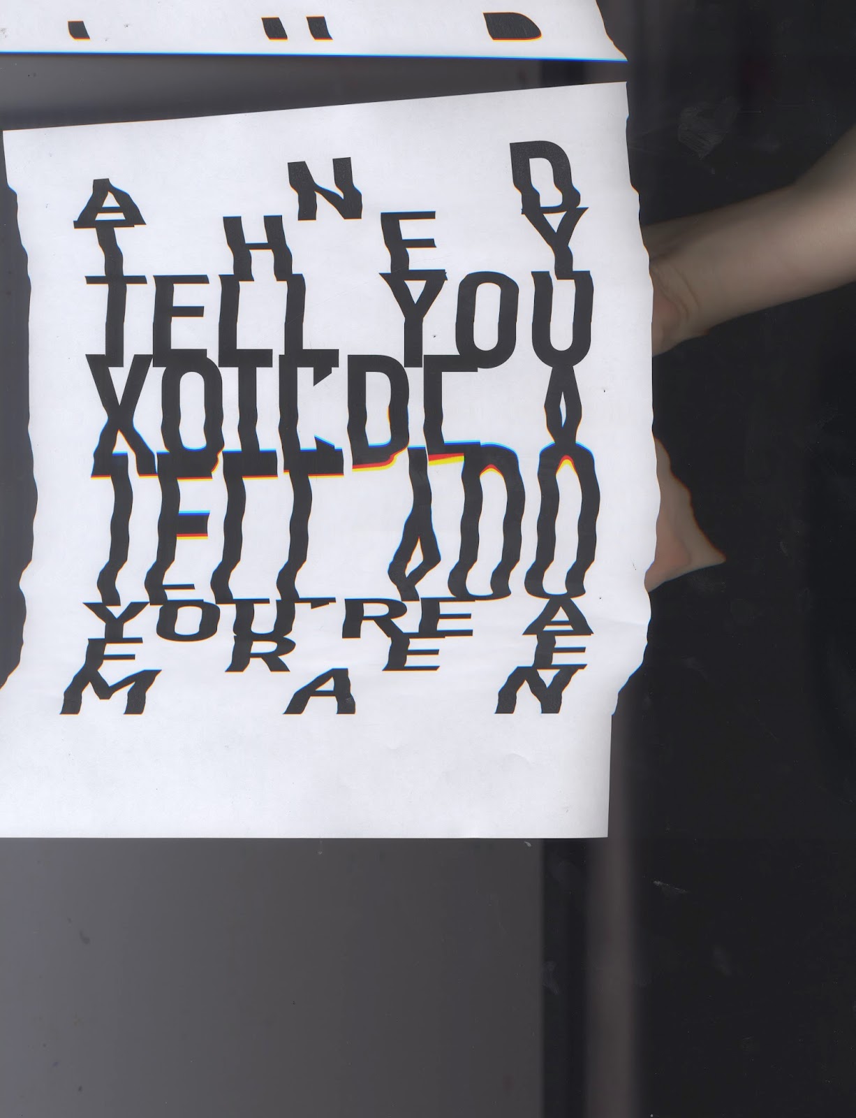


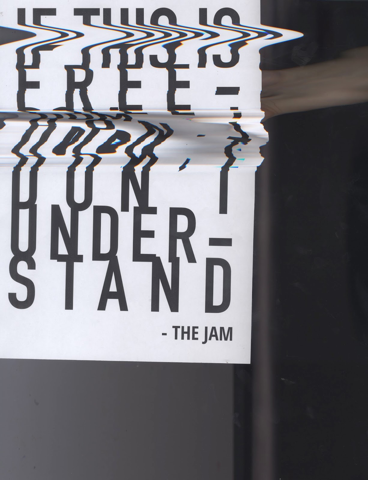


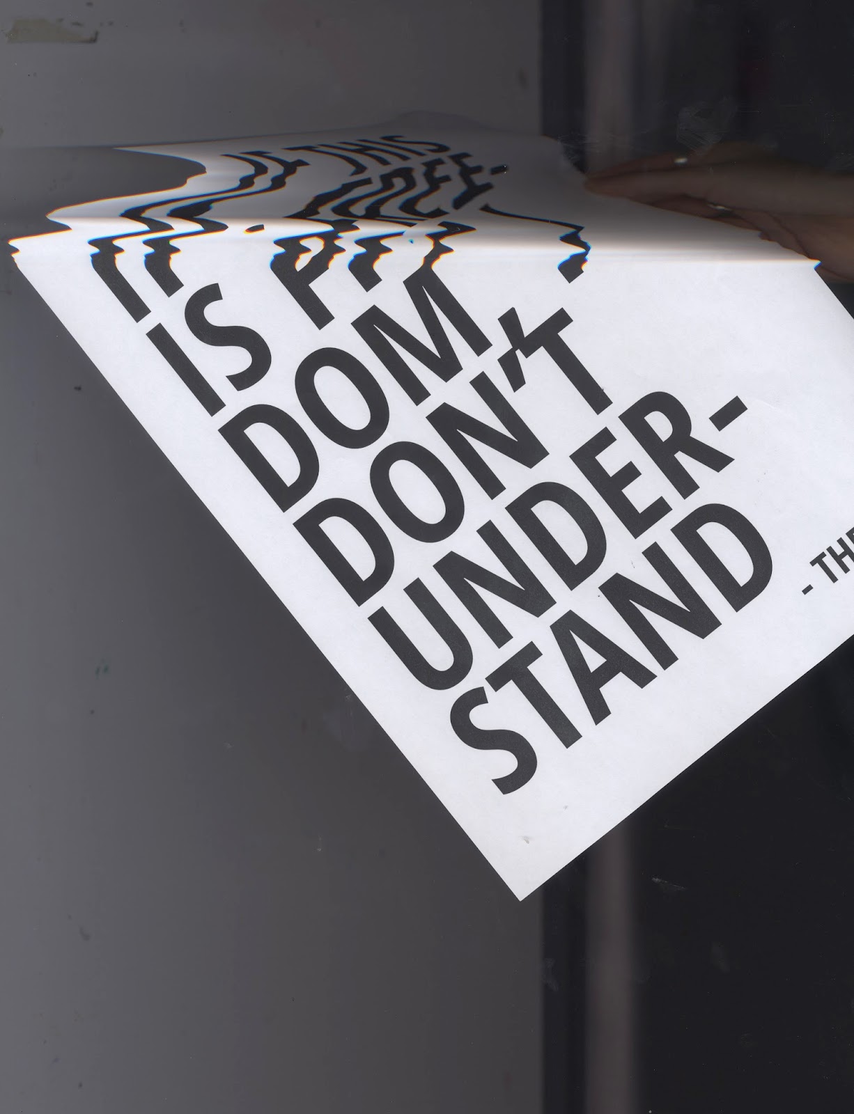


Scans are common in hand made punk zines. However, the example above are too distorted, making the text very difficult to read.
The design chosen to take forward uses a minimal background. The images are small which means they retain quality and the white space means the images don't over power the text. The typeface used is Open Sans Condensed bold. This is a very legible typeface while being bold enough to make an impact. The text fully justified for stylistic effect.
The posters will be screen printed as punk had a large following that was involved in the DIY culture. This low tech method is also reminiscent of the protest posters used in the student marches in France (1968) and Soweto (1976).
To represent this digitally I have 'multiplied' the assets to get an idea of how the final product will look.
Colour combinations:


No comments:
Post a Comment