Sunday 22 April 2018

OUGD505 - Overall Module Evaluation


OUGD505 


Overall Module Evaluation


This module was heavily research based in all areas. Practice, technical and conceptual research was conducted to gain expert knowledge on relevant subjects. This created work that is relevant and well considered. Both briefs in the module allowed for personal interests to be explored and independent solutions to be executed.
Studio 
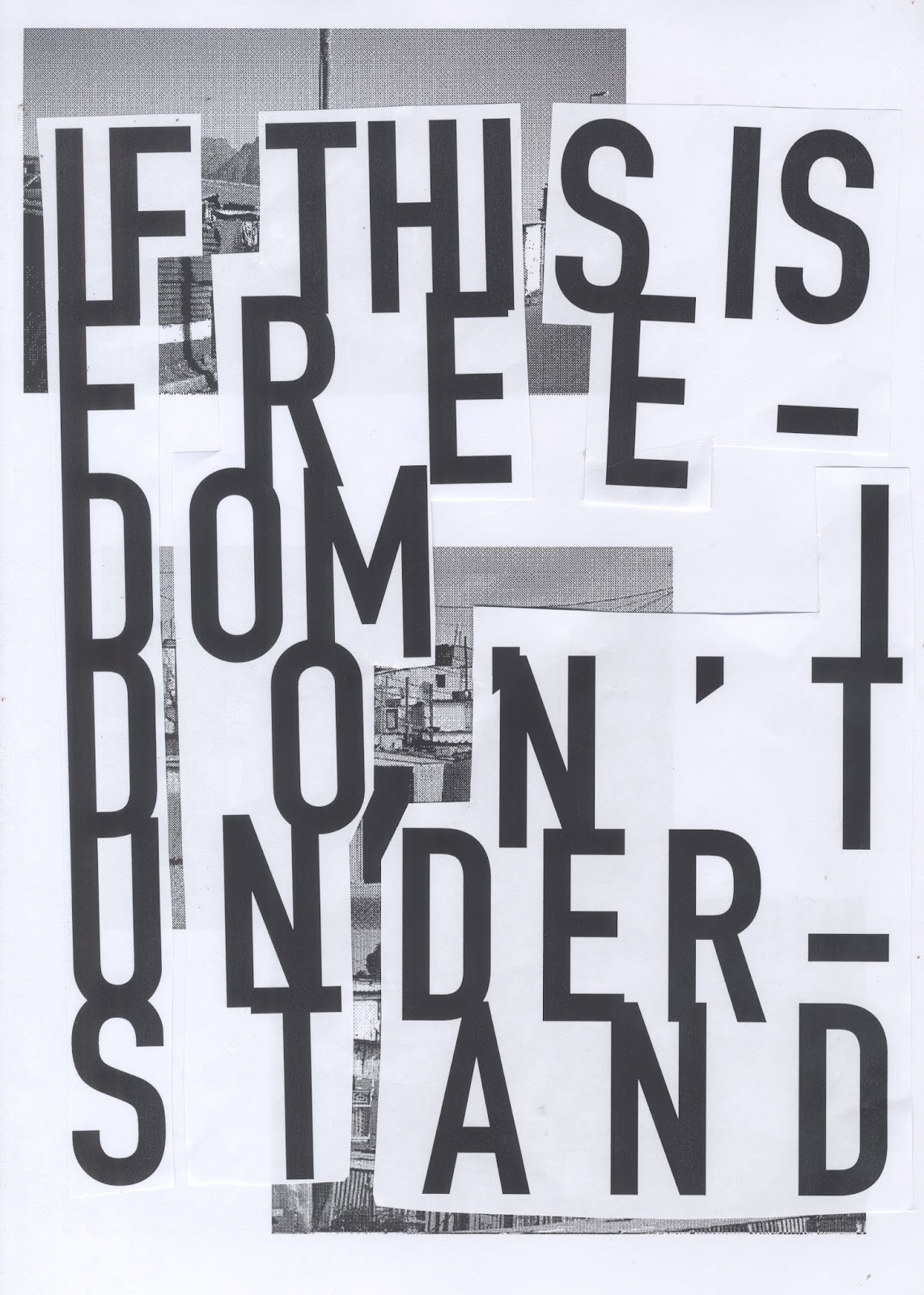
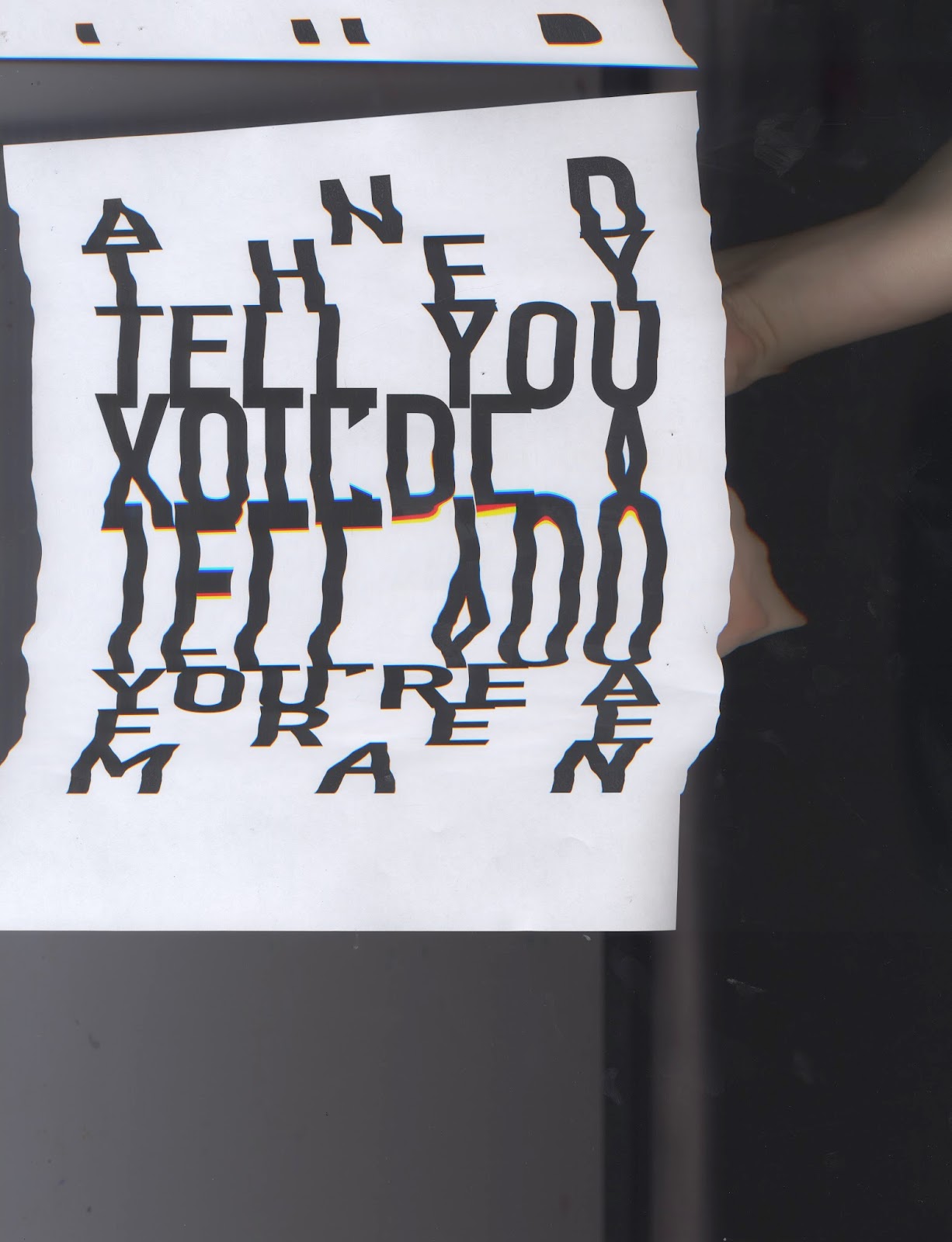
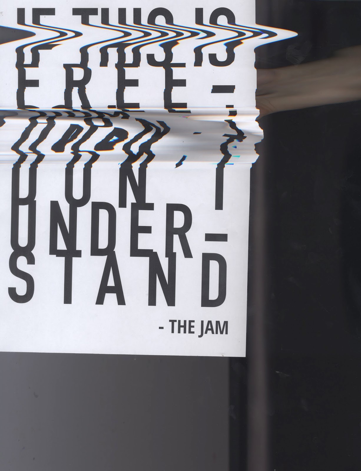
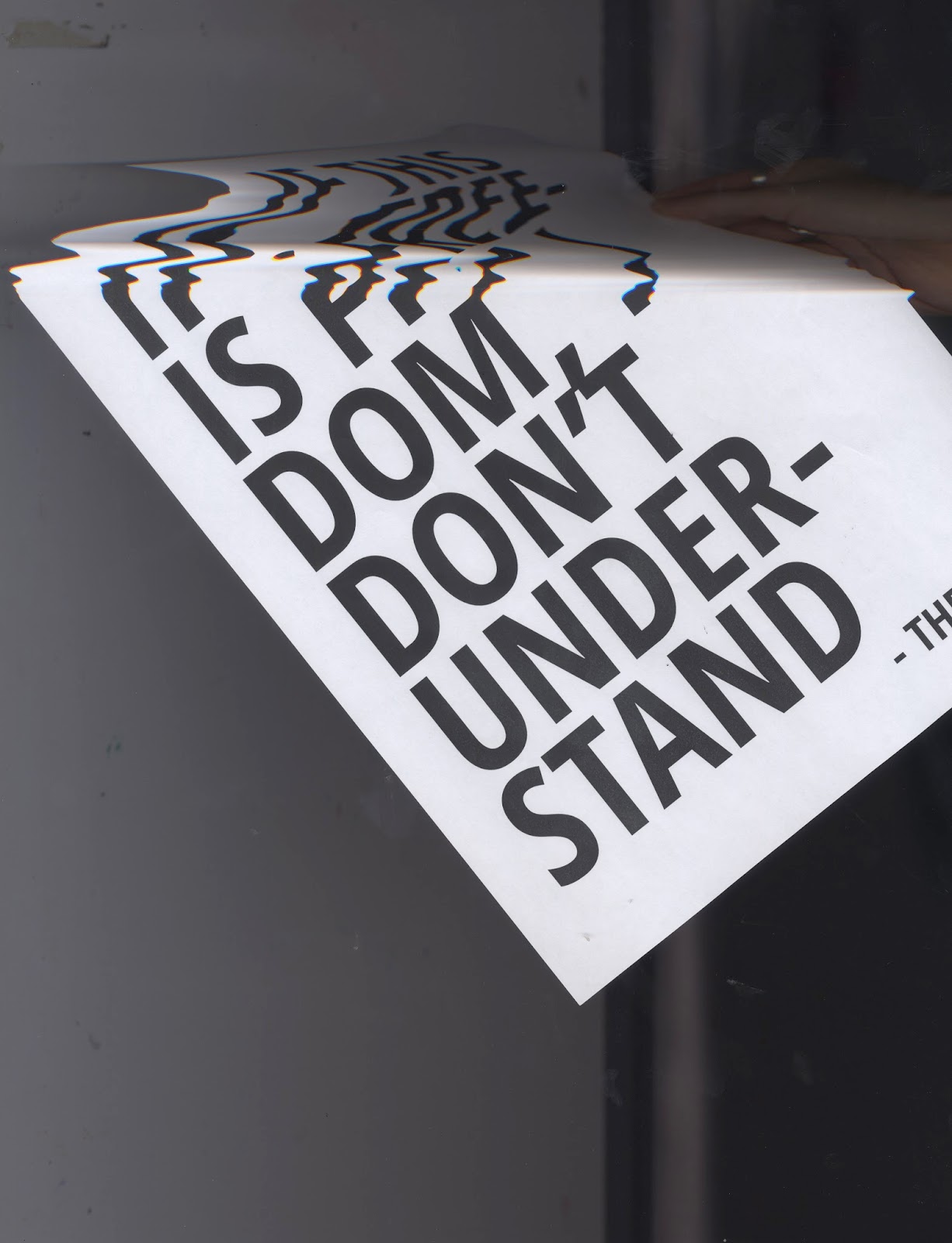
brief one was very open. The genre chosen was punk. I am happy with the result, I think it carries a strong message and hope It will gain some sort of reaction. The idea behind it was based on the protest mentality as I feel people my age often complain about the state of things but actively do very little about it. I found researching the punk genre to be interesting and found that Punk is more about politics and youth culture than the music itself. I think my research skills are improving as I am using more varied source like documentaries and podcasts rather than just website articles.
The outcome is a set of two posters. It is an appropriate response. However, the brief asked for an object to be produced and I think if I allowed more time for development the outcome could have developed to be something more substantial and ambitious, not simply print based. If I was to do this brief again I would have chosen a genre I knew nothing about, purely for my own awareness.
Studio brief two required outputs that related to social, political and ethical change. The research for this brief was in-depth. It included the examination of existing ethically motivated design campaigns as well as primary and secondary research, specific to the chosen cause. This brief allowed me to explore something I was passion about and get first hand understand how the same issue affected other people through primary research. Presenting findings in front of a group has helped improve my public speaking as well as giving much needed experience of how to present data in a visually interesting way. I think I applied my research to create an interesting an original product that would be successful in creating change. The range created was consistent and wide distribution is achievable. I do think there is still room to push this brief further and create a presence online. I will continue to work on this brief after submission to create a design guideline booklet that I will include in my portfolio.
Overall I think my outputs for this module are not equal in result. My final output for studio brief two is much more substantial both in design and development than my output for studio brief one. I feel that both briefs would have benefited from more peer led feedback from outside of my friendship group, even if its self-initiated. Time management could have been improved, especially in relation to studio brief one. In the future, I will plan my time more effectively, breaking it down by brief, rather than module.


OUGD505 - SB01 - Final Outcomes

OUGD505


SB01

Final Outcomes


The final posters are screen printed on white card. This stock was chosen as the stark white will make the colour more vibrant.The black and red colour combinations were chosen over a more obvious punk inspired colour scheme such as pink and yellow as it highlights the seriousness of the issue. A brighter colour scheme may have lowered the tone.

The end product is only a two posters. If time allowed I would have liked to have done more posters based on other political issues. The style could be applied to many different topics, keeping the relevant background images monotoned and half toned and the text overlaid on top.

Friday 20 April 2018

OUGD505 - SB01 - Developments

OUGD505 

SB01

Developments

'If this is freedom' Posters

A two part poster based on lyrics by the Jam from the song 'A' Bomb in Wardour Street (Album: All Mod Cons).

The Lyrics:

And they tell you that you're still a free man
If this is freedom I don't understand.

Political message:
Apartheid in South Africa. 
Apartheid ended in 1991. As part of apartheid the government at the time segregated the population into different living quarters within cities under the 'Grouped Areas Act' (1950). This was based in race hierarchy with white people being at the top of the hierarchy, followed by Indians, coloured and lastly black people. In areas assigned to black people the government provided some 'matchbox' houses but massive overpopulation of these areas lead to tin houses being common place. This is still true today in townships such as Soweto. Living conditions are still poor and poverty and crime is still very high. After almost 30 years of aparthied being abolished living conditions haven't improved for those who were forced to live in segregated communities. 

The aim of these posters is to highlight the poverty that still exsist now and create any sort of reaction that might ignite change.


Photo Cred: Moses Gathua
https://www.123rf.com/photo_50670523_soweto-town.html


Typeography


The most appropriate way to create this poster is screen printing as it is hand made and in line with the punk DIY culture. 

Halftoned images of shanty tones:


Developments


Physical Manipulation
Collage


]

The aesthetic mimics the classic punk style. Although I thin the pastiche comes across quite lighthearted. I don't think this is appropriate for such a strong message.

Scans


The Scans 

Scans are common in hand made punk zines. However, the example above are too distorted, making the text very difficult to read.

The design chosen to take forward uses a minimal background. The images are small which means they retain quality and the white space means the images don't over power the text. The typeface used is Open Sans Condensed bold. This is a very legible typeface while being bold enough to make an impact. The text fully justified for stylistic effect. 

The posters will be screen printed as punk had a large following that was involved in the DIY culture. This low tech method is also reminiscent of the protest posters used in the student marches in France (1968) and Soweto (1976).

To represent this digitally I have 'multiplied' the assets to get an idea of how the final product will look. 

Colour combinations: