OUGD404
Evaluation
of Leaflet
Evaluation
of the leaflet I created in response to Studio Brief 01 – How Do You Read?
For this
submission I created two small printed leaflets, one titled How Do You Read?
And another titled International Klein Blue. How Do You Read included:
· Information on Josef Albers, his
background, education and contribution to colour theory.
· A photograph of Leeds with colour
swatches and an evaluation of these swatches.
· Colour theory research
· Words on RGB Vs GMYK
· Information on Pantone
· An explanation of the use of colour
within graphic design
· Research on Tint and Shade
· Information about Hue, Saturation
and Value.
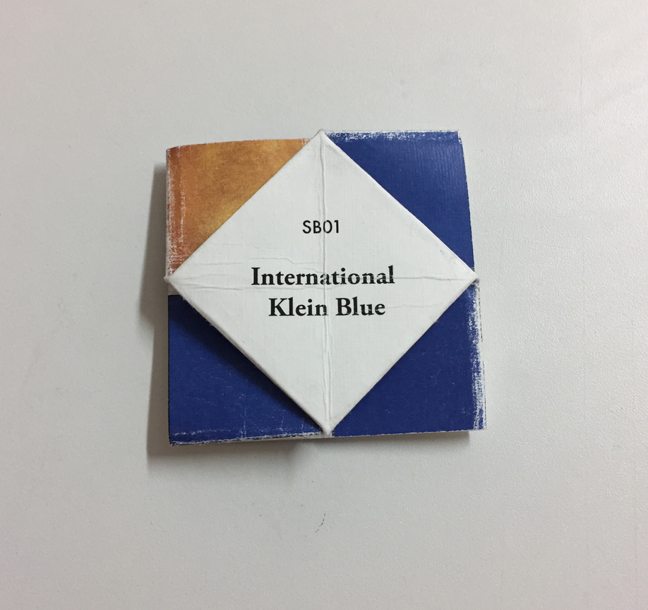
International
Klein Blue included:
· What Klein Blue is
· Information on Yves Klein
· Examples of Klein Blue within
graphic design
For my
leaflet I chose quite a complicated and challenging method of folding. The
final design was inspired by the work of Roger Chi-Huan Chuang. The Intricate
folding created a modular grid system on the page. I used this to my advantage
and laid each leaflet out using this grid system. It gave the leaflet a good
flow and allowed information to be separate. The typeface I chose for the body
text in my leaflet was future and I used Garamond for the title text. I chose
these two typefaces as they work well together and they are legible even at
very small sizes. I considered using a serif text for the body text as the
serifs make each letter more individualised and therefore more legible, however
I think the sans-serif typeface works with the composition and design of the
leaflet more successfully. For the leaflet ‘How Do You Read?’ I set the type in
the dark blue from the swatches as the colours in this leaflet are organic and
natural and the use of black for the type would be too harsh in contrast. I
chose different stock to print my leaflets onto. I chose a light brown card to
print ‘How Do We Read?’ on to as it gave an organic and rustic feel which
suited the colour scheme of the leaflet. For the International Klein Blue leaflet,
I used a white textured stock as I wanted the Klein Blue to pop of the page and
the best way to do this was to use a crisp white paper.
Upon
reflection there are a few things I would change about the leaflets I produced.
First, I would make them larger in size. I used a square of 15cm by 15cm to
create the leaflets. This works well for the Klein Blue leaflet as it contains
less information. The same dimensions where used for the ‘How Do We Read?’
leaflet, which contains much more information. The design of the leaflet meant
I had to rigidly stick to the grid system, the only way to resolve this was to
use a smaller text. In the final printed product, I feel the type is too small
and quite difficult to read. I would also change the stock I used. In both
leaflets the folds are messy and the ink has cracked. I think this is because
the stock I used was too thick and therefore more difficult to fold. In my
experiments with folding before I printed my final piece the thicker paper held
its shape better and this is what led me to choose these particular stocks. However,
I did not consider how the paper would affect the ink once it had been folded. I
would also change the paper I printed the ‘How Do You Read?’ as the colour of
the paper effected the colours that were printed, making them dull. Another thing I would change is the guttering in the grid system I have used, It needs to be bigger to balance with the margins.


No comments:
Post a Comment